Feed on
Posts
Comments

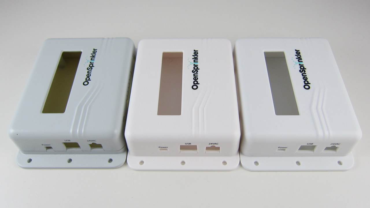
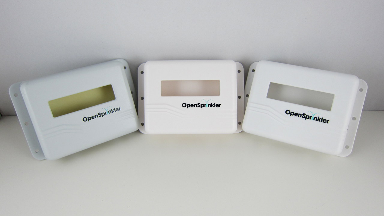
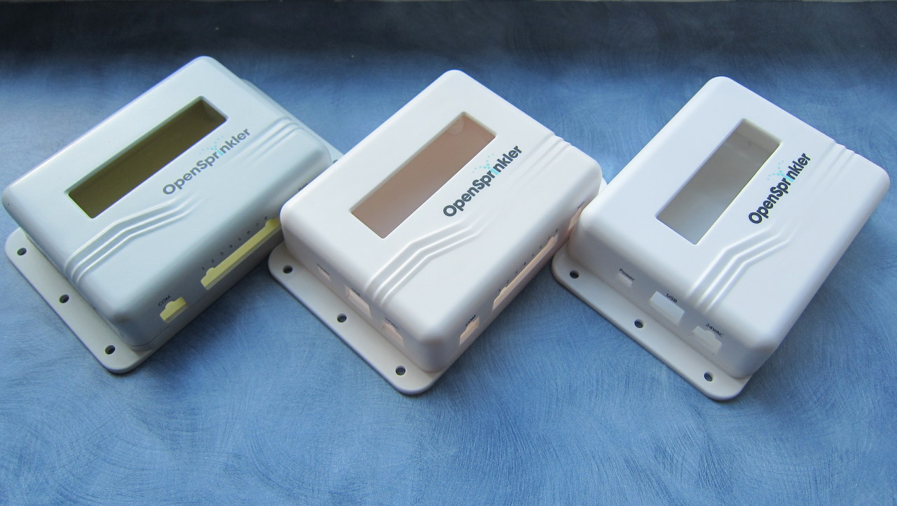
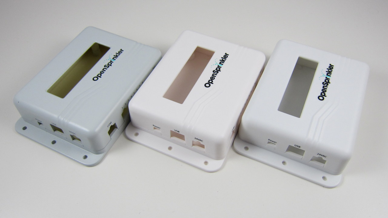
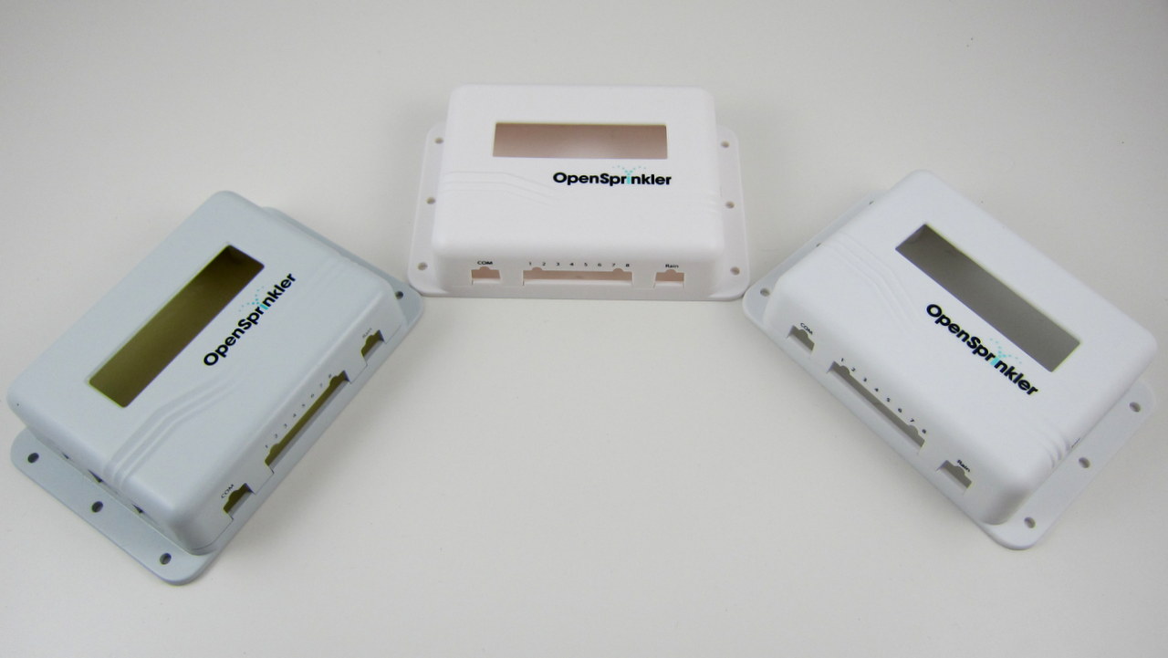
The final sample of the injection molded enclosure has arrived. Very exciting! The moment of decision: I’ve got three samples, each with a slightly different color. I’ve taken a few picture of all three side by side. The differences are subtle, but basically the first one (left) is more gray-ish, the second one (middle) is closer to milk white, the third one (right) is closer to pure white. Please vote for your favorite color in the comments section below (you can either use 1, 2, 3, or left, middle, right, or anything un-ambigious). I’ve only got a couple of days to give them my final decision, so please vote as quickly as you can. Thanks!
IMG_3003-001

IMG_3006-001

IMG_3005-001

IMG_3004-001

IMG_3000-001

21 Responses to “Moment of decision: which color do you prefer for the OpenSprinkler enclosure?”

  1. Myles says:

    3! It really highlights the logo best.

  2. Luke says:

    1 is too dark … 2 is too white …. 3 is good.

  3. Samer Albahra says:

    I have to agree, 3 is the best! 1 is the runner up though.

  4. Richard says:

    Another vote for 3.

  5. Dillon says:

    I like 1 the best. I feel like it would hold up to sunlight the best without fading/yellowing

  6. Mark Driedger says:

    3 is the best, followed up by 1

  7. Cody says:

    1. Grey. These things are in areas that will be subject to abuse. Nicks. Scratches. Mars. Also, white plastic does yellow fairly quickly. It’s less noticeable on grey.

  8. Brian says:

    Another vote for 3

  9. Ron says:

    1 is best the others will eventually yellow.

  10. Dwayne says:

    Its a shame you don’t have time to do a “weather” test, see how the colors look after 3 months in direct sunlight.

    Ipod white would be popular, but the grey is probably more practical in terms of fading/yellowing over time.

  11. David says:

    Yep, definitely number 1 for the grey.

  12. Bambam says:

    I vote for 2 – to be the first one so far for that colour.

  13. Zapp says:

    #3 is perfect.

  14. xabs says:

    +1 for plain white

  15. Andrew Radke says:

    I’d go for 2.
    1 looks too way too grey for me, like some sort of generic case rather than the thing you’ve spent so much time and money on.
    Otherwise 3, but where I live we have red soil and I think 2 would look cleaner after a while even if it was in fact dirtier.

  16. Nate says:

    #3 all the way.

  17. Gioacchino says:

    3, no dubt !

Leave a Reply